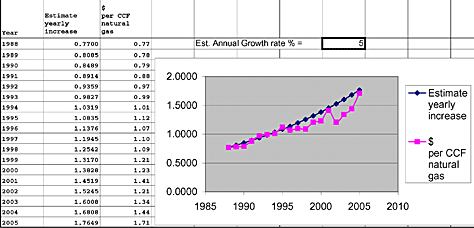
The cost of natural gas from 1988 through 2005
a spreadsheet illustration using Microsoft Excel
By Charles Bovaird
Five phases are required for data analysis: Data collection, Data entry, Data analysis, Graphic representation, and Interpretation.
(1). Data collection.
The data collection phase of analytical problems is generally the most expensive. More recent improvements using computers to collect data have simplified the process for simple problems. Collecting large amounts of data automatically in some cases has simplified the data collection phase, but has also encouraged the collection of larger data samples with more detail, thus adding to the complexity of the process.
A plethora of computer applications have been created to address these more complex problems. Many require expert treatment by specialists trained in management science/operations research. Complex problems have always existed. One currently in the media is PLM (Product Lifecycle Management). In the past, PLM has been addressed using large-scale computers where the cost justified the means. Now that we have powerful desktop computers, PLM products and services may make sense to smaller businesses. This example is but a simple Excel model to identify some questions that could be addressed developing a PLM model.
In this illustration the data source was collected over the years 1988-2005 from the monthly billing statements. $/CCF (100 cubic feet) was used because CCF was the major cost component.
(2). Data entry
Starting with a blank spreadsheet, do the following: In cell A1 enter the word “year”. In cell B1 enter the words”5% per yr increase” (line breaks can be executed by positioning the cursor, hold, alt, enter. In cell C1 enter “$ per CCF natural gas”.
To enter numeric data, enter in cell A2 “1988”. In cell A3 enter “1989”. Highlight cells A2 and A3. Place the cursor on the small box in the lower right hand corner of cell A3, press Left click-hold-and drag down the A column to A19, and release. This procedure changes the year values by +1.
Next, we enter the data from our data source into column C for each year. In cell B2 we copy the value from C2 (0.77).
(3). Data analysis
Initially we do not know the annual percentage increase so we will design the spreadsheet and graph in such a manner as to test various percentage values and observe the effect on the projected trend line. Type into cell E2 the words “Est. Annual Growth Rate % -”, In cell h2 type an initial estimate value = 5. Calculate the following years’ values by first typing the formula “=$B2*(1+$H$2/100)” into cell B3.Now highlight cell B3, point to the drag handle (lower right hand corner of B3) and drag to B19 and release.
(4). Graphic representation
Because a graph usually generates more insight than a table of numbers, we now create a graph.
Highlight columns A, B, and C. Click on the graph icon at the top of the spreadsheet. Now click on the type of graph (scatter graph in this case). Next click on the graph display you wish to use. Now click next, next, finish.
The graph is now displayed on your spreadsheet. You can now use “click, hold, drag” to modify the location and shape of the graph on the spreadsheet.
File, save spreadsheet as “Natural Gas price analysis 1988-2005”.
(5). Interpretation
By changing the percentage value in cell H5, we can observe the projected growth line relative to the annual price data. Some questions the user of this model could consider are:
(1). What is an appropriate historical price growth rate?
(2). What is an appropriate projected price growth rate? Include your rationale.
(3) What problems does a projected 5% price growth rate portend for people on fixed income?
(3). What caused the trend change in 1994 and in 2005?
Charlie Bovaird is a retired IBM-er, who never stopped thinking about a better mousetrap.
|